Quick Summary
When choosing tile color palettes, start with the room’s fixed materials and the light it receives—not a tiny showroom sample alone. A clear undertone, a grout plan, and a few intentional transitions can make kitchens, baths, and entryways feel connected without making every room match.
Tile color palettes Chester County homeowners choose do more than set a mood. They influence how a room reads in morning light, how easily adjacent finishes work together, and whether a renovation still feels considered after the paint, cabinetry, and furnishings are in place. The most useful palette is rarely a single color; it is a small group of materials whose undertones support one another.
That is especially important in homes where a renovated kitchen opens to an older dining room, a primary bath has both daylight and artificial light, or an entryway is the bridge between dark exterior doors and lighter living spaces. Rather than trying to make every tile surface identical, use a few practical decisions to create a calm visual rhythm throughout the home.
If you are still deciding which rooms belong in the same project, Milford Mills Tile can help you compare options across its tile installation services before you commit to a material direction.
Start With the Materials That Are Staying
Before selecting tile, list the finishes that are not changing: flooring that continues beyond the room, cabinet color, countertop stone, wood trim, fireplace surrounds, and exterior-door stain. These elements provide more useful direction than a trend board because they will be present every day.
Look for undertones rather than broad color names. A surface described as white may lean cream, gray, blue, pink, or green. A tile described as beige may read sandy, taupe, or yellow beside a countertop. When those undertones fight, a room can feel unsettled even when each individual finish is attractive.
For a kitchen remodel, bring cabinet and counter samples to the tile selection. For a bathroom, include the vanity finish and metal hardware. For an entryway, consider the front door and the flooring visible through the nearest opening. A palette becomes easier to manage when the decisions begin with the elements that have the longest lifespan.
Read Samples in the Light They Will Actually Receive
Showroom lighting is useful for comparing products, but it is not the final test. Borrow or purchase samples and view them in the actual room at more than one time of day. A north-facing room, a sunny kitchen, and a bath lit mostly by warm fixtures can reveal the same tile very differently.
Place samples vertically when choosing backsplash or shower-wall tile and horizontally when considering a floor. That small change makes reflections and grout lines easier to judge. If a tile will meet a painted wall, put the paint chip beside it. If it will sit under a countertop edge, view it with that material too.
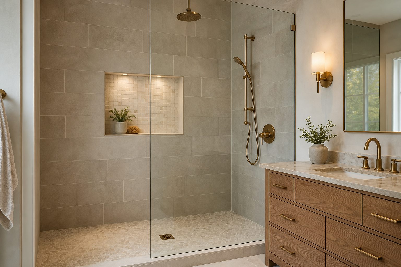
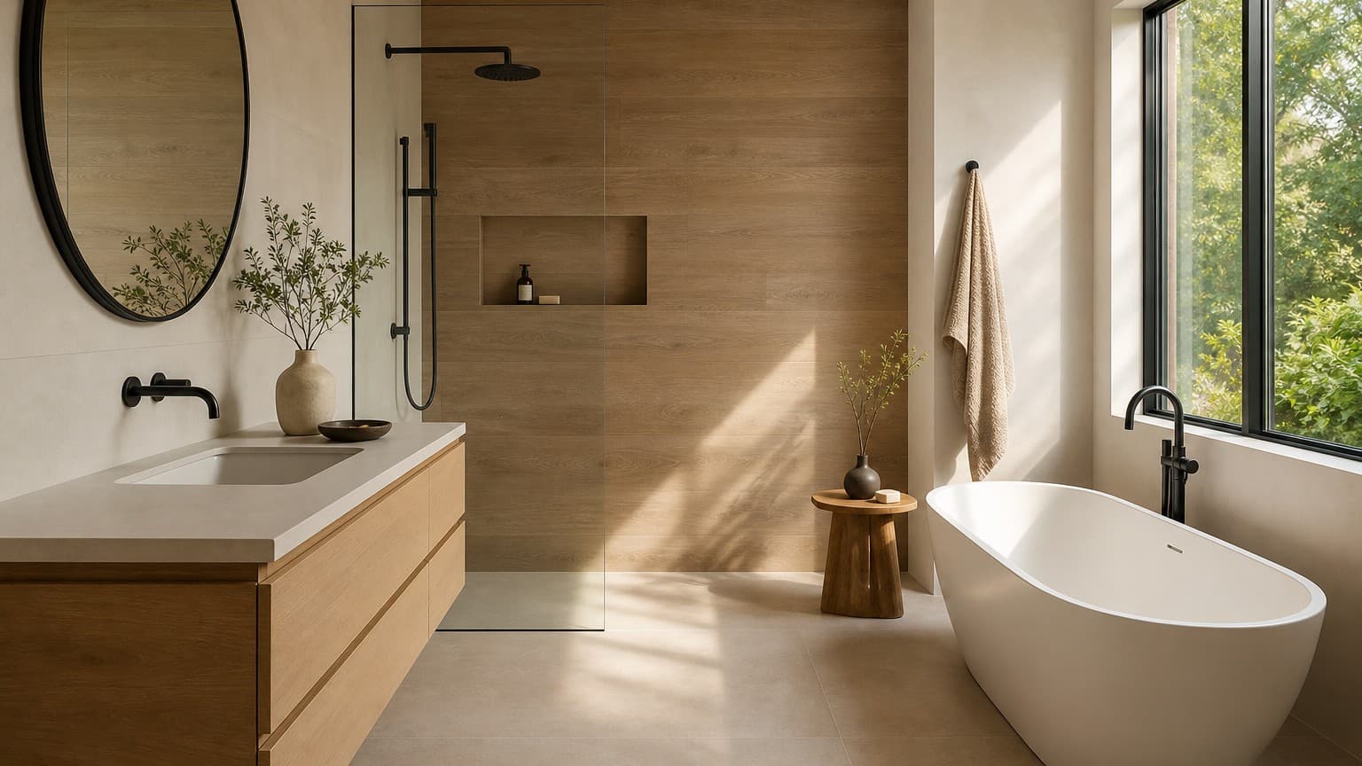
A warm-gray or greige tile can be a flexible choice when the surrounding materials carry warmth. A cooler gray can work just as well in a more contemporary space, but it should be selected deliberately rather than assumed to be neutral in every setting.
Get a Free Tile Quote
20+ years installing bathroom, kitchen, and custom tile across Chester, Delaware & Montgomery counties, PA.
Build a Palette With One Lead Surface and Two Supporting Notes
A simple structure keeps tile selection from becoming overwhelming. Choose one lead surface—the largest or most visually important tile—and then use two supporting notes. The supporting materials may be a quieter wall tile, a mosaic accent, a related grout color, or a finish that repeats elsewhere in the room.
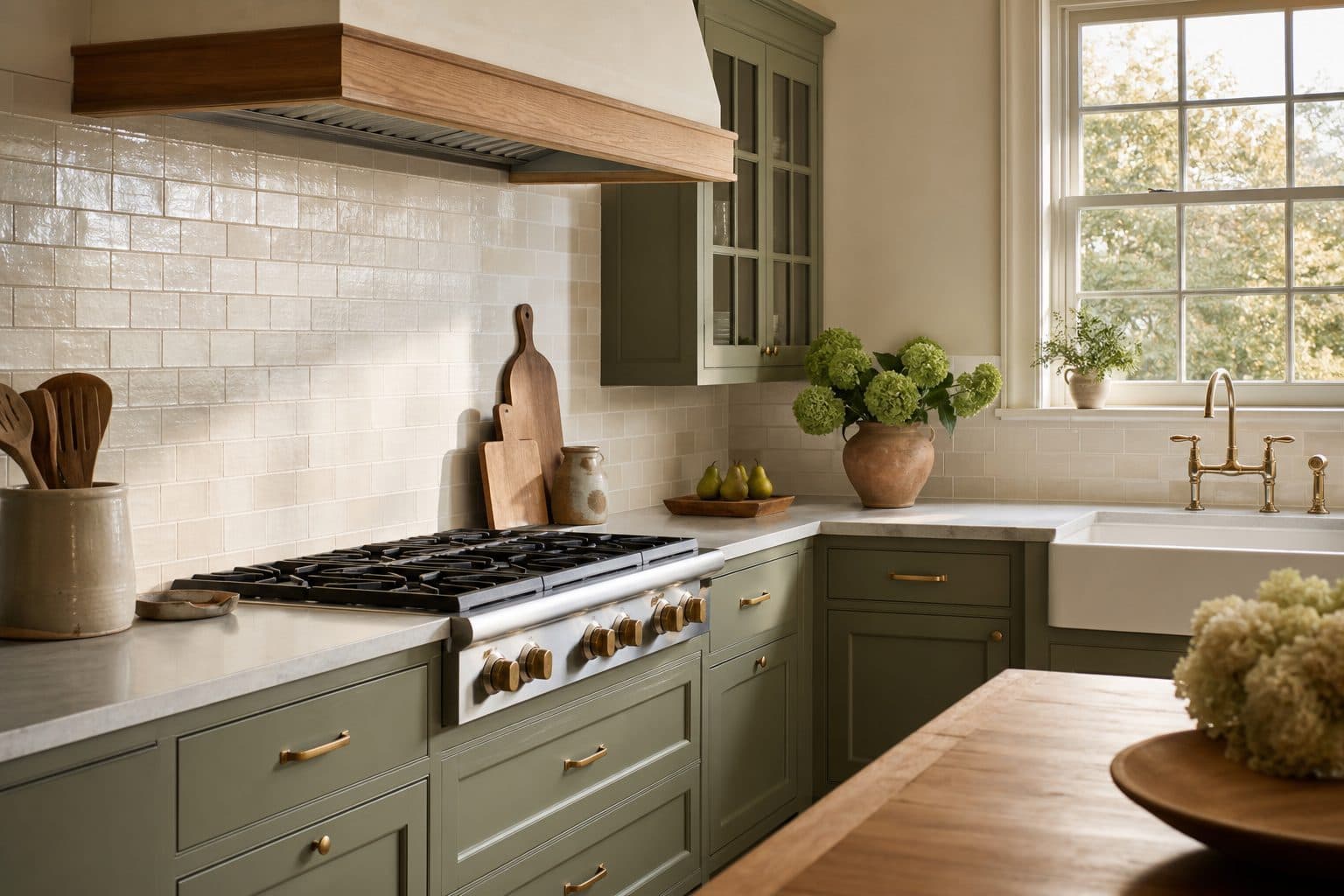
For example, a kitchen may use a soft off-white backsplash as the lead visual surface, a natural oak or muted green cabinet finish as a supporting note, and a warm metal or charcoal detail as the second support. A shower may use a calm field tile, a modestly contrasting niche mosaic, and a floor tile that grounds the room without demanding attention.
This approach avoids two common problems: adding so many accent materials that the room loses focus, or choosing every surface in exactly the same tone until it feels flat. Contrast can come from texture, scale, sheen, or grout—not just a dramatic color change.
Let Grout Participate in the Design
Grout is not an afterthought. It changes how much of the tile pattern the eye sees and can make the same tile feel crisp, soft, traditional, or contemporary. A closely matched grout lets the field read as a quieter plane. A contrasting grout defines individual pieces and gives a layout more graphic presence.
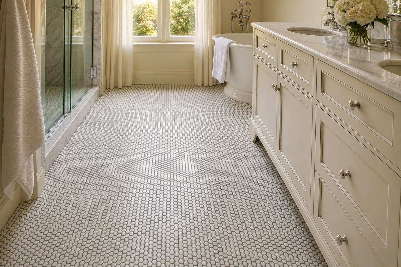
Neither choice is universally better. In a small-format backsplash, a contrast may make the pattern an intentional feature. On a large floor, a close grout match can help the room feel calmer. Review a grout board beside the exact tile, and make the decision after seeing the tile at the planned orientation and scale.
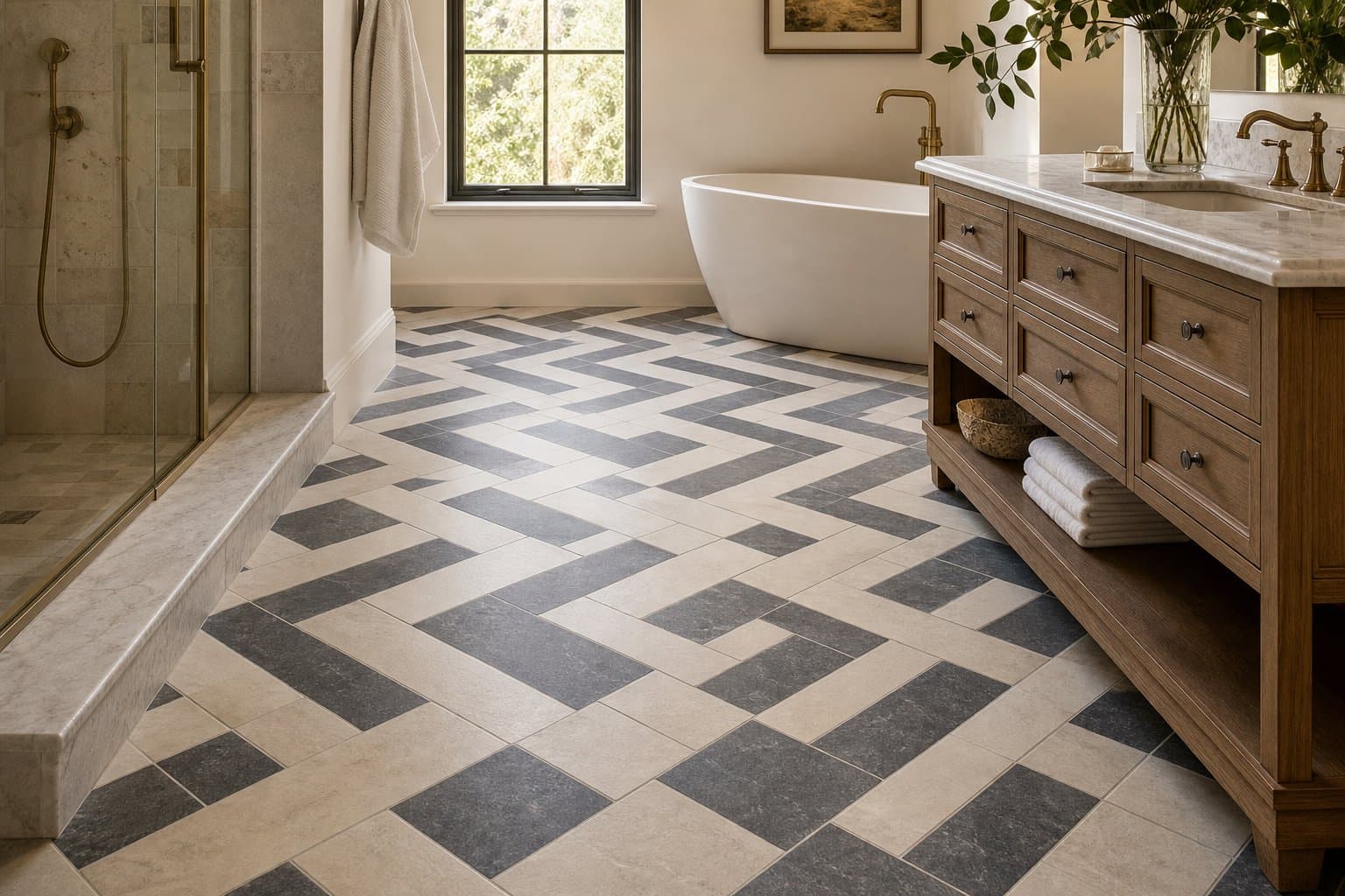
The same principle applies to transitions. A room does not need every grout line or every floor tile to match the next room, but the shift should feel intentional. A repeated warm undertone, a shared wood finish, or a related neutral can make separate spaces feel connected.
Use Room Function to Refine the Color Choice
Color has to work with the room’s daily use. An entryway needs a floor that still looks composed after wet shoes, pets, and regular traffic. A kitchen backsplash can carry more visual character because it is seen at eye level and is usually a smaller field. A shower floor may need a different texture or scale than the walls, even when both belong to the same palette.
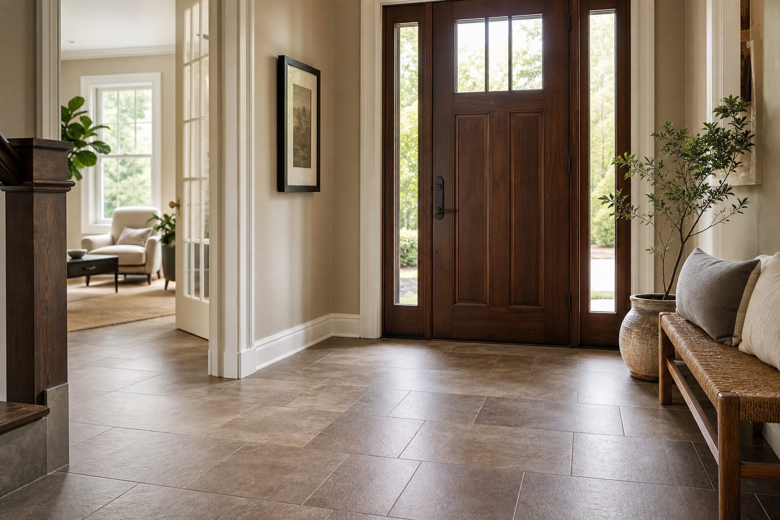
For kitchens, compare your palette against the functional choices in our kitchen tile work. For baths, see how wall tile, floor tile, niches, and shower details can be coordinated through bathroom tile projects. The goal is not to make every room look the same; it is to choose a material hierarchy that fits each room’s job.
Keep the Long-Term View in Mind
A color palette does not have to be plain to last. It does, however, benefit from a strong foundation. Use the largest and hardest-to-replace surfaces for colors and materials you can live with over time. Save the bolder move for a niche, a small backsplash field, a powder-room wall, or an accent that can stand on its own.
It can also help to separate inspiration from imitation. A photo may suggest a useful balance of warm and cool materials, but the right choice for your home still depends on its own light, architecture, and neighboring finishes. Reviewing completed tile projects can help you identify the combinations that feel durable and personal rather than temporary.
For more inspiration on using tile as a room-defining surface, see our guide to tile accent walls in Delaware County living and dining rooms.
A Practical Selection Checklist
- Bring samples of cabinets, counters, paint, wood, and metals to the tile selection.
- View tile in the installed room during daylight and with the room’s regular lighting.
- Name the lead surface, then limit the number of supporting finishes.
- Choose grout after seeing it with the tile at the intended scale and orientation.
- Plan transitions between connected rooms instead of selecting each surface in isolation.
- Use functional needs—cleaning, traffic, moisture, and layout—to narrow the final choice.
When you are ready to turn a palette into a specific material and installation plan, request a quote from Milford Mills Tile.
Frequently Asked Questions
Do all tile colors in an open-concept home need to match?
No. Connected spaces can use different tiles while still feeling cohesive. Repeat an undertone, a finish, or another material so the transition feels planned rather than accidental.
Should grout match the tile exactly?
Not always. Closely matched grout can make a surface feel quieter, while a contrast can make the layout more visible. The best choice depends on tile size, room scale, and how much pattern you want to see.
How can I tell whether a tile is warm or cool?
Compare the sample beside a clean white sheet, your countertop, paint, and wood finishes. Looking at several materials together makes subtle green, blue, cream, pink, or yellow undertones easier to identify.
What is the safest starting point for a long-term tile palette?
Start with the finishes that are staying and choose a durable lead tile that works with them. Use smaller, easier-to-change areas for stronger contrast or a more expressive accent.
Can a bathroom use different wall and floor tiles without looking busy?
Yes. A quiet field tile paired with a smaller floor tile or restrained niche accent can add depth. Keep the undertones and the number of competing visual elements under control.