August 4, 2026Milford Mills Tile TeamKitchen Tile8 min read
How to Match Kitchen Tile With Cabinets and Countertops
Share
Quick Summary Cabinets and countertops are the most expensive, hardest-to-change surfaces in a kitchen, so tile should be chosen to match them — not the other way around. This guide covers reading undertones correctly, choosing backsplash and floor tile that bridge your existing finishes, and the grout decisions that make or break the final look.
Matching kitchen tile with cabinets and countertops is one of the most common questions Chester County homeowners bring to us before a renovation starts. It makes sense — cabinets and countertops typically cost far more than tile and are far more disruptive to replace, so tile is almost always the piece that should adapt to what's already staying. Get the undertones and contrast right, and a kitchen feels pulled-together the moment you walk in. Get them wrong, and even beautiful individual materials can clash.
Milford Mills Tile is Wedi Certified and Schluter Certified, with over 20 years of experience and more than 1,000 completed tile projects across Chester County, Delaware County, Montgomery County, and the Main Line. Here’s the process we walk clients through when tile needs to work with cabinetry and countertops that are already chosen — or already installed.
Matching Kitchen Tile With Cabinets and Countertops: Where to Start
Start with whatever is hardest and most expensive to change. In most Chester County kitchen projects, that’s the cabinets, followed closely by the countertop. Tile — whether it’s a backsplash or a full floor — is comparatively easy and inexpensive to swap later, which is exactly why it should be the element that responds to everything else in the room, not the other way around.
Before looking at a single tile sample, lay your cabinet door and countertop sample side by side in the room where they’ll actually live. Chester County kitchens see everything from north-facing light in older stone colonials to bright southern exposure in newer Main Line builds, and the same cabinet and countertop pairing can read warm in one kitchen and cool in another. We always evaluate materials on-site, in the client’s actual lighting, before recommending tile.
Reading the Undertones in Your Cabinets and Countertop
Undertone — the subtle warm or cool cast beneath a material’s main color — is what makes or breaks a match. Two whites, two greys, or two wood tones can look nearly identical in isolation and clash the moment they’re side by side, because one leans warm (yellow, gold, pink) and the other leans cool (blue, green, grey).
A few reliable tells we use on-site:
White cabinets. Hold a pure white sheet of paper against the door. If the cabinet looks creamy or yellow by comparison, it’s warm. If it looks grey or blue by comparison, it’s cool.
Quartz and granite countertops. Look at the veining, not the background color. Warm veining runs gold, taupe, or brown; cool veining runs grey, black, or blue-grey.
Wood-tone cabinets. Natural wood almost always leans warm, but the intensity varies — a honey oak reads much warmer than a smoked or grey-washed walnut.
Once you know the undertone of your fixed materials, tile selection gets dramatically easier: warm cabinets and countertops pair best with tile in cream, warm white, sand, or taupe; cool cabinets and countertops pair best with tile in true white, soft grey, or blue-grey. Mixing warm and cool deliberately can work as a design choice, but it should be a decision — not an accident discovered after installation.
100+ Five-Star Reviews
Get a Free Tile Quote
20+ years installing bathroom, kitchen, and custom tile across Chester, Delaware & Montgomery counties, PA.
Backsplash Tile That Bridges Your Cabinets and Countertop
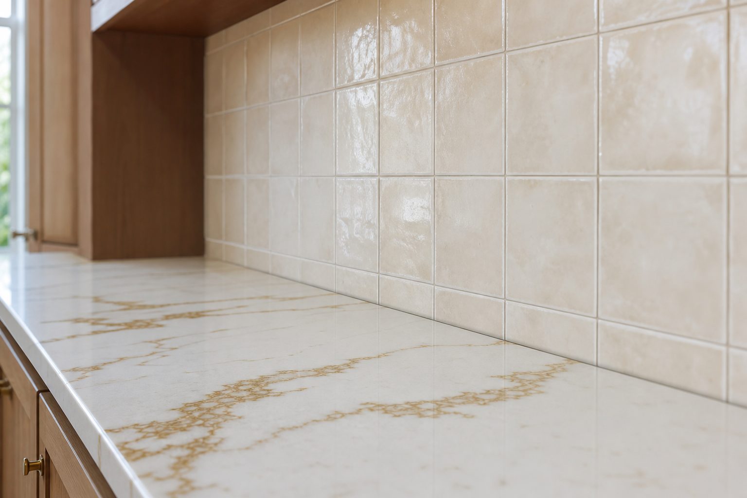
The backsplash sits directly between the cabinets above and the countertop below, which makes it the hardest-working — and most forgiving — place to correct a near-miss in undertone. A backsplash tile that pulls a secondary color from the countertop veining, or echoes the warmth (or coolness) of the cabinet finish, visually stitches the two together even when they don’t match perfectly on their own.
A few pairings we install often in Chester County kitchens:
Warm white cabinets + warm-veined quartz: a soft cream or oyster subway tile in a 3×6 or 3×12 format, set with a warm white or beige grout.
Cool grey cabinets + grey-veined quartz: a matte grey or greige zellige-style tile with visible texture, which keeps the pairing from feeling flat or sterile.
Wood-tone cabinets + neutral quartz: a warm taupe or clay-colored tile that reads as a natural extension of the wood rather than a competing element.
Kitchen Floor Tile: Coordinating Tone With Your Cabinetry
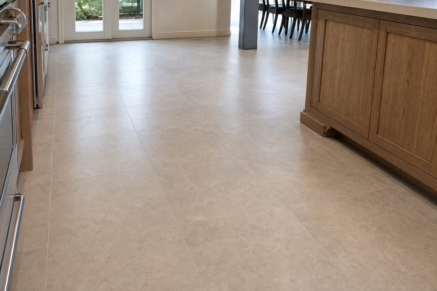
Floor tile has a different job than backsplash tile: instead of bridging two finishes at eye level, it has to ground the whole room from below. The safest approach in most Chester County kitchens is a floor tile that’s a shade or two darker or lighter than the cabinets — enough contrast to define the space, not so much that the floor competes for attention.
For warm cabinetry, we typically recommend a warm greige or sand-toned porcelain floor tile; for cool or true-white cabinetry, a soft dove grey or warm-neutral concrete-look porcelain keeps the room from feeling clinical. Large-format tile (12×24 or larger) in a straight-lay or gentle offset pattern also helps an open-concept Chester County kitchen feel continuous with adjoining living and dining spaces. Our full kitchen floor tile guide walks through material options, layout patterns, and installation cost ranges in more detail.
Grout Color Choices That Support the Match
Grout is the detail homeowners most often underestimate — and the one most likely to throw off an otherwise well-matched kitchen. As a rule:
Matching grout (close to the tile color) keeps the focus on the cabinets and countertop, letting the tile recede into the background. This is usually the right call when the cabinets or countertop are the visual star of the kitchen.
Contrasting grout makes the tile pattern itself a design feature. It works well with simple cabinetry and countertops, where the tile is meant to add personality, but it can compete with an already-busy countertop or ornate cabinet profile.
Grout undertone matters as much as grout darkness. A cool grey grout against warm cream tile and warm cabinets will read as a mistake even if the value (light/dark) is correct. We color-match grout to the tile’s undertone first, then adjust darkness for the look the client wants.
Common Kitchen Tile and Cabinet Pairing Mistakes We See in Chester County Homes
A few patterns come up again and again on renovation walkthroughs:
Choosing tile under showroom lighting, then installing it in a kitchen with very different natural light. Showrooms use consistent, often cool-toned lighting that can flatter a tile’s undertone in ways your kitchen’s north-facing window won’t. Always bring a tile sample home and view it at different times of day before committing.
Matching the countertop’s background color instead of its veining. A white quartz countertop with warm gold veining paired with a stark, blue-white tile will fight the countertop every time. The veining — not the base color — carries the real undertone information.
Treating grout as an afterthought. As covered above, the wrong grout undertone can undo weeks of careful material selection. We ask clients to approve a grout sample against the actual tile and cabinet sample before we mix a single batch.
Skipping the on-site sample check. Online photos and even in-store displays rarely represent a material’s true undertone accurately. We bring physical samples into the client’s kitchen, next to the actual cabinets and countertop, before any tile order is finalized.
Ready to get your kitchen tile, cabinets, and countertops working together? Request a free, no-obligation quote and we’ll bring samples to your home to find the right match in your own light.
Frequently Asked Questions
What if my cabinets and countertop are already installed?
That’s the most common starting point we see. We bring tile and grout samples directly to your kitchen and evaluate them against your existing cabinets and countertop in your actual lighting, rather than relying on a showroom or an online photo. Because tile is the least expensive and least disruptive material to change, it’s almost always the piece we adjust to match what’s already there.
Should my backsplash tile match my countertop exactly?
Not exactly — a backsplash that matches the countertop too closely can look flat or make a busy countertop pattern feel overwhelming. A better approach is pulling one secondary color or undertone from the countertop into the backsplash tile, which coordinates the two surfaces without making them identical.
Can I mix warm and cool tones in one kitchen?
Yes, but it should be a deliberate design decision, not an accident. Some of the most striking Chester County kitchens we’ve installed pair a cool countertop with warm wood-tone cabinetry, tied together by a tile choice that leans slightly toward one side to keep the room from feeling split down the middle.
Do you help choose tile, or just install it?
Both. Milford Mills Tile brings physical samples to your home, evaluates them against your cabinets and countertop in your actual light, and makes a recommendation before any material is ordered. We serve Chester County, Delaware County, Montgomery County, and the Main Line with over 20 years of experience and more than 1,000 completed projects.
Questions? Call Us Directly
Serving Chester, Delaware & Montgomery counties, PA